Alisha Ober
Senior UX + UI + Product Designer
Senior UX + UI + Product Designer
At Neo.Tax, the engineering team adopted Tailwind UI to accelerate development and maintain consistency across products. However, the design team lacked a matching component library in Figma, forcing designers to create UI elements from scratch. This created a disconnect between design and development, resulting in inconsistent components, duplicated work, increased development effort, and difficulty keeping designs aligned with Tailwind UI updates. As the design system scaled, existing Figma library approaches became difficult to maintain and caused performance issues.
As the UX designer, I was responsible for creating a scalable Figma component library that mirrored Tailwind UI, improved collaboration between design and engineering, reduced design-to-development inconsistencies, and could be maintained efficiently as the Tailwind ecosystem evolved. The solution also needed to remain flexible enough for designers while avoiding the performance limitations of large Figma libraries.
I began by evaluating existing design system approaches and identifying the shortcomings of traditional component libraries, including excessive component variations, maintenance overhead, and inconsistent implementations.
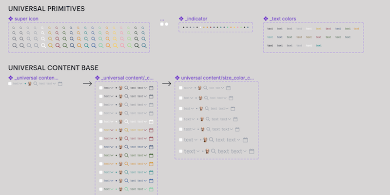
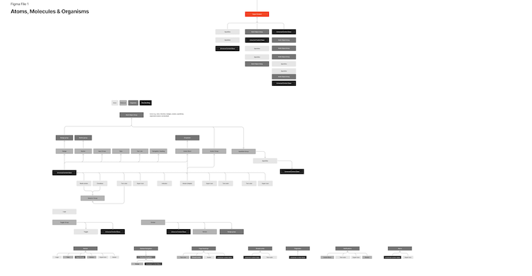
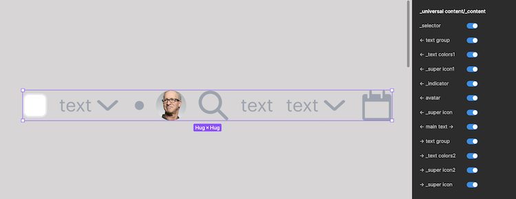
To create a more flexible system, I initially designed an atomic design framework built around reusable atoms, molecules, and organisms. Central to this approach was a Universal Content Base (UCB), a configurable component that allowed designers to quickly enable or disable common UI elements such as icons, avatars, labels, indicators, and supporting text without breaking components.
During testing, I discovered that the highly configurable structure significantly increased file size and memory usage because hidden elements were still rendered by Figma. Large files began exceeding 100MB, causing performance degradation and crashes.
To address these issues, I pivoted the strategy and implemented three major improvements:
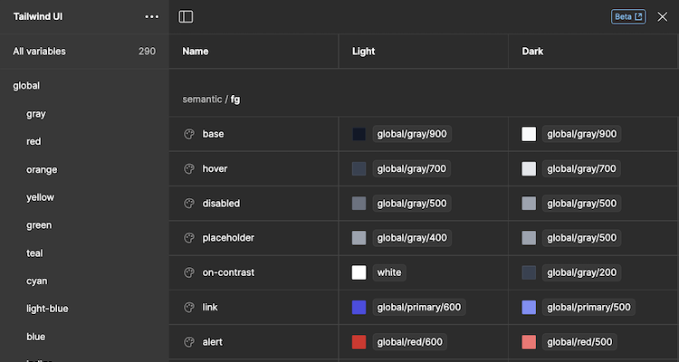
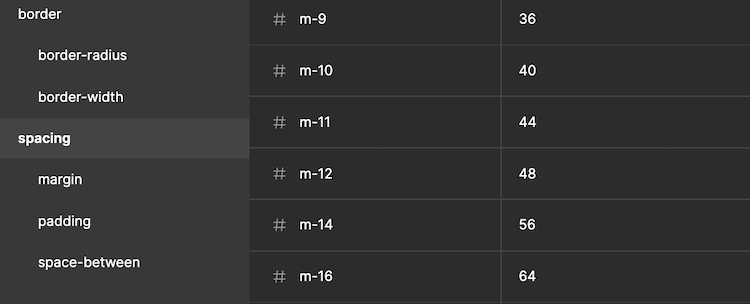
Beyond solving internal challenges, I expanded the library with additional functionality, including enhanced Tailwind-inspired components, semantic color systems, local variables for spacing and border values, and improved configurability. I also prepared the system for public release as an open-source resource for the broader Figma community.
The redesigned component library successfully aligned design and development workflows around a shared Tailwind UI foundation, reducing inconsistencies and improving collaboration between teams.
Key outcomes included:
This project reinforced the importance of balancing configurability with performance and demonstrated how thoughtful design system architecture can improve efficiency across both design and engineering teams.